Watch the Credits
SWEET PRUDUNCE: OPENING CREDITS by SweetPrudence
One of the goals of any low budget film is to add visual pizzazz with minimal expense. On Sweet Prudence we thought one place to add a bit of zing would be the title sequence, though even while we were in postproduction we had no idea how to accomplish that with our financial limitations. We’d have to be creative and pragmatic at the same time.
It would be unrealistic to think a low budget film can compete with a dazzling title sequence like Casino Royale, or any other eye-popping studio blockbuster. But a smaller film can be clever and create something that, while affordable still makes the audience smile and is organic to the films concept. Various ideas were tossed around, ranging from flash animation to give us a Pink Panther feel, to more elaborate concepts- none of which were appropriate or affordable.
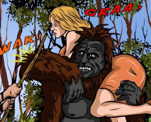
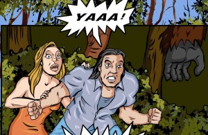
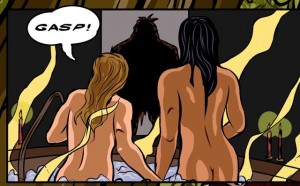
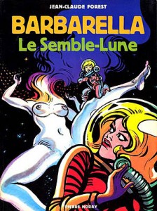
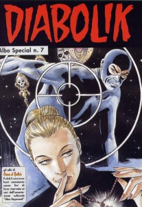
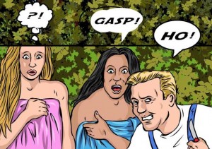
Along the way the idea of creating a comic book opening popped up and really seemed like the right way to go. It would establish the film’s fantasy tone and retro spirit perfectly, and we felt Sweet Prudence would appeal to aficionados of comic books who would appreciate a fun adult romp a la Barbarella or Diabolik.
Great idea, now all we needed was someone who could pull it off. On a major studio picture top comic artists would submit their concepts and a long development process would begin. We couldn’t do that, so instead an ad was run on Craigslist and to our good fortune, Aaron Lane was among the applicants. Aaron was ideal for the task at hand – his preferred style was close to what we envisioned, he had an encyclopedic knowledge of comic books and the flexibility to adjust his artwork to compliment the 1950’s EC Comics mood of the title sequence. After one meeting with the director it was obvious Aaron was an amazing artist and the go-to guy. Now we had an artist, so it was time to take the next step.
FUN STUFF FROM AARON LANE
When the budget is tight it’s important to minimize the workload on the artists, and eliminate as much guess work as possible. The budget and schedule also dictated that the final video postproduction work be as straightforward as possible. So, once again you have to recognize your limitations and act accordingly.
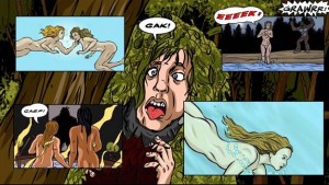
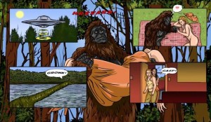
With those restrictions in mind we elected to create a comic book cover, and five additional pages all drawn to suit the aspect ratio of HD television. Each page would be a freestanding piece of flat art, and the individual panels within that page would also be drawn to suit the HDTV aspect ratio. The finished pages would be converted to graphic files allowing the video editor to plot simple, but elegant moves that suited the tempo of the music. Hopefully all of the video post could be achieved within Final Cut Pro. I’m sure a high-end post house could find dozens of more expensive methods to achieve the goal, but this low-tech approach suited the project just fine.
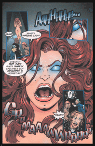
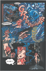
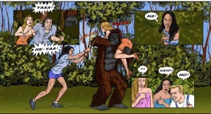
Although it would’ve been fun to create an actual comic book version of the film, we decided against creating linear story pages. They wouldn’t have been as visually dynamic, and would give away the story during the opening credits – always a bad idea. Instead we opted to create panels depicting each major character, and fill the remainder of those pages with fun, exciting images. There was still a lot of detail work to be done before Aaron could begin drawing the actual artwork.
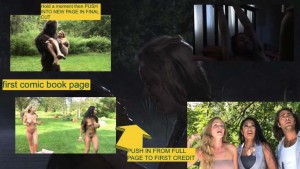
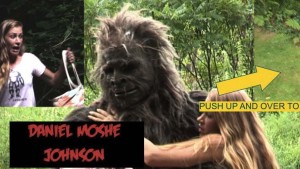
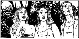
The director pulled still frames from the film depicting the type of action that would introduce each character as dynamically as possible. A storyboard movie was made painstakingly testing the page moves. The resulting roadmap was composited into sample JPEG pages and those graphics were delivered to Aaron.
BELOW – THE INITIAL TEST BOARDS USING STILL IMAGES
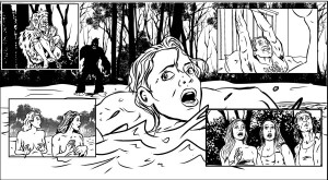
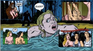
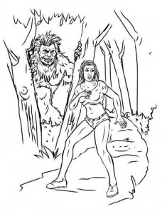
 Using the composited stills as a placement guide, Aaron began creating the original artwork. His art was far more dynamic in composition than the stills and really gave the sequence visual flair. Additional stills from the film were pulled and sent as a reference for specific facial features, hair color etc. He created initial sketches, which were very close to the mark and then moved on to drawing the very colorful final pages.
First sketches
Aaron even created a very precise final comic book panel that allowed a seamless dissolve from the artwork into the actual film. These are the details that can really give an independent film polish, and shows the audience that you actually care – which we do.
Aaron’s finished pages were then put back into the storyboard software, and each frame was double checked to ensure that images were within title safe, and that it accommodated all the required title cards. It looked great.
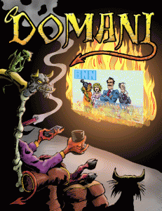
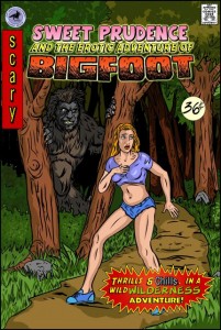
The comic book cover was final piece of artwork to be created. This was drawn close to classic comic book size, but modified so the top portion would fit in the HDTV frame – allowing us to tilt down to reveal the lower half. The cover depicted Prudence in her “heroine” pose, and Aaron really captured the femme fatale feel, despite his initial sketches leaning a bit more towards a muscular “warrior princess” feel. It was such a great image that it became a second film poster, and even made it onto some T-shirts.
The comic book cover is also the film’s onscreen title. We opted to draw the film’s title within the actual comic book art, ensuring that it all fit within title safe. Fortunately computer software allowed Aaron to create an alternate version of the cover with no title. This permits overseas distributors to insert the written title in their own language, so in Latin America it might become “la prudencia dulce y la aventura erótica de Bigfoot”. My apologies to Spanish speaking people everywhere –I just used Google translator.
After Aaron completed all of the arduous work of creating the pages it then fell to Chris Brown, the film’s editor to plot out the visual moves and make them flow with the Theremin intensive musical score. Fortunately Chris is a huge fan of both comic books and horror movies, so he was able to make a great little sequence within the limited amount of time available. As a bonus there were enough comic book panels that had been only fleetingly seen to create a nice end credit sequence.
When the film had its theatrical screening at the Cinekink International Film Festival the title sequence received a lot of compliments, which felt great. The end result may not make viewers gasp in awe at the amazing special effects work, but it does make people smile and, just maybe, reflect for a moment on all those comic books their mom threw away. If we accomplish that on such a small budget we’re doing okay.
